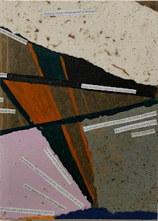
This journal is a combination of beautiful colors and using my handmade papers. I mixed and matched to design the outcome. I have a small box that I keep phrases that I cut out and collect from newspapers and magazines. Therefore, when I need any particular phrases that I want to include in my design I have it!
During the process, I visualize in my mind how the journal will look like, the purpose of this journal and who might enjoy writing on them. Then I gather all the materials and place them on my desk... mind thinking process is fun and enjoyable.
Using all the researches that I have gathered from books that I shall mention soon. But one that I really love is ‘Interaction of color by Josef Albers’. It helps me to work with colors and balance the outcome design for the cover.


No comments:
Post a Comment